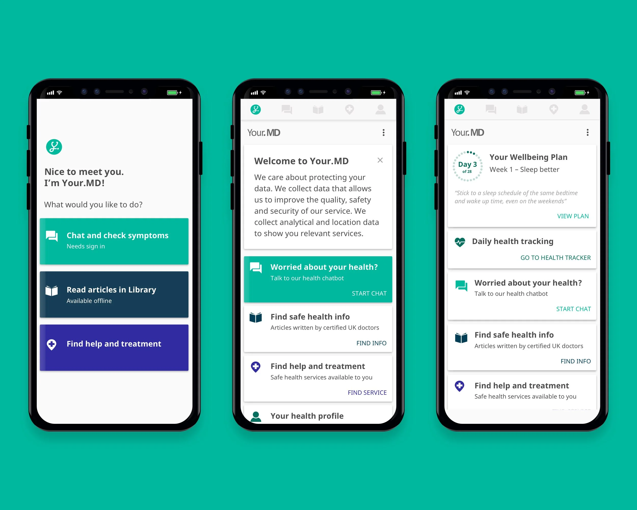
The evolution of the home page from MVP to Phase 3 release
My Role: Junior Visual & UI Designer
My Responsibilities: UX | UI | Research | Testing | Prototyping
Company: Your.MD
Platform(s): Android, iOS
THE PROBLEM
Hi… Bye
When downloading a new app, you’d expect a certain level of guidance. Your.MD’s however, lacked an onboarding or even home screen. Instead, it was a simple static page that reflected the main navigation architecture. Upon clicking any of these buttons, users were dropped into main features of the app.

Your.MD’s previous static landing screen
First impressions are key to setting a users expectations and likelihood to engage with a product.
Through brief user testing and analytics, it was evident that users were appealed to the app but once there, they struggled to discover the extent of its features or value. This was reflected in a large number of single time users and day 1 app uninstalls.

User journey mapping the previous App first-time experience - this identified key pain points and opportunities
Early Insights:
Users became frustrated and ‘lost’ when landing in the app
Early app experience didn’t deliver on expectations set from app store, value proposition and adverts
YMD app lacked onboarding and ‘first time’ experience
No clear starting point for app
THE OPPORTUNITY
Create a warm welcome
Home screens are a basic yet essential page for most apps. They are a place to guide and help users whilst also becoming dynamic personalised spaces of content and tasks. They are also a great feature for product teams to showcase and surface new and hidden content to their users.
The aim:
To create a more meaningful and personalised welcome experience to YMD users
I hypothesised that by creating a more guided and personalised experience, it would improve retention and see an increase in engagement. I felt this would be possible through the introduction of a home screen to the Your.MD app.

Exploring new opportunities and themes to test in the onboarding experience
THE PROCESS
Welcome home!
The first thing to do was to create a home page within the app. The initial concept was simple albeit easy to create from a tech perspective. It mirrored the original landing page with cards and buttons to the main verticals of the app.

The first YMD home screen iteration
The second phase of this process focused on introducing basic personalised cards to user’s homepages which prompted actions within the app. These started off as tasks such as prompting users to complete their profile information or a welcome message. We prioritised new cards at the top of the page and tested if highlighting them made a difference. I quickly noticed that users were very receptive to the card hierarchy on the home page.
Whatever was on top, got clicked!
Profile completion rates increased by 30% through the ‘Complete your profile’ card.

The first test of the new homefeed - Rearranging the hierarchy and exploring visual prioritisation through design
This was confirmed with an ABCD test of different card orders and combinations on the homepage. We used the term ‘meaningful actions’ to describe essential tasks within the app. We’d noticed a correlation between completing these tasks and the likelihood a user would return. Success was determined by the number of ‘meaningful actions’ completed by each test cohort, user retention and 7-day engagement.
This was a large project that iteratively introduced more personalised and interactivity to the apps home screen with each release. We conducted testing sessions in house and remotely via tools such as Usertesting.com to understand how users first time experience varied.

The progression of the Your.MD app’s home page through this process. Previous Landing Page > Phase 1 > Phase 2
THE IMPACT
Things got personal.
Adding a homepage to the YMD app created a wealth of opportunities to introduce more personalisation and engaging experiences within the app. It welcomed users and guided them to engage with ‘meaningful actions’ whilst also prompting returning behaviour. This led to an increase in core feature interactions and user data. I believe that this increase in guidance and personalisation led to more engagement and a higher 7 day retention.
The success of this exercise began a larger process of improving the whole onboarding experience and YMD internal IA, functionality and personalisation for users. Phase 2 of the homepage began to see logic introduced. Depending on actions completed and the user’s relationship with the app, the home page began to feature new and more relevant cards.

Phase 2 cards introduced to the home feed - Product feedback, signups, health tracking, feature links
With limitations on how quickly we could introduce changes to the app, I began exploring the future of this feature and how it would change as the app developed. I found taking a concept further than technically possible at the time a great way to communicate the future goals and direction of this project. This helped gain more support from the development team and stakeholders.

I used ideation and wire-framing to explore ways to introduce more personalisation

Defining the future of the YMD app home page and where it could progress - What did personalisation look like?

Future homefeed conceptual designs - Exploring hypothetical concepts was an exciting task and helped the product team to define future features and visual design directions
MY TAKEAWAYS
Slowly, but surely
Big changes take time - With each release I found it very rewarding to see the progress towards our goal of having a personalised landing experience in the app.
Empathise more with technical limitations and expect delays - The project and its requirements created and uncovered a lot of technical debt due to how the app worked and the projects requirements for users data. This was frustrating as it would delay and slow the process further. My biggest takeaway was to have a greater understanding of the technical difficulties of creating and introducing new features.
Try to make more affordances within my designs - Design a lot, release a little. Create features that can be rolled out in smaller stages without impacting on the users experience.